Rapid Prototyping with dat.GUI
Demo and prototype components with minimal configuration.

In isolated projects like demos, CodePen, CodeSandbox, or even within projects where Storybook has been implemented, I continue to love leveraging the classical dat.GUI as a fast robust solution.
It provides property panels, akin to authoring solutions of Adobe or exposing property to the inspector in Unity.
Getting Started
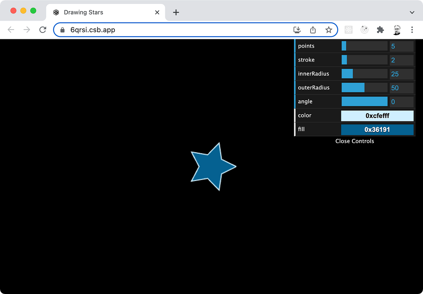
Out of the box, dat.GUI automatically adds itself to the DOM in the upper right corner upon construction of a new instance:
import * as dat from 'dat.gui';

const gui = new dat.GUI();
The above example places dat.GUI in the upper right:
Custom Placement
If you need to place or incorporate it elsewhere, you can override its
Create a div to contain the dat.GUI element in html:
<div id="gui"></div>Style via CSS as needed:
#gui {
  position: absolute;
  top: 0;
  left: 0;
}
In JavaScript, specify autoPlace as false and insert dat.GUI’s DOM element:
const gui = new dat.GUI({ autoPlace: false });document.querySelector("#gui").append(gui.domElement);
The above example places dat.GUI in the upper left:

Controlling Object Properties
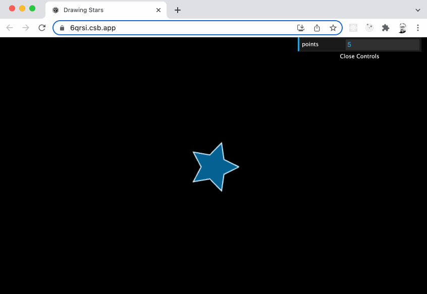
To view and manipulate properties of an object, attach dat.GUI’s controller to an object instance and specify the property to be controlled.
For example, say we have a state object, and want to attach a controller to that object’s points numerical property:
const state = {
  points: 5,
};gui.add(state, "points");
Within dat.GUI, we will see the “points” property name and an input box showing the current value. This input is editable, setting the property on submit by pressing enter.
Min / Max Slider
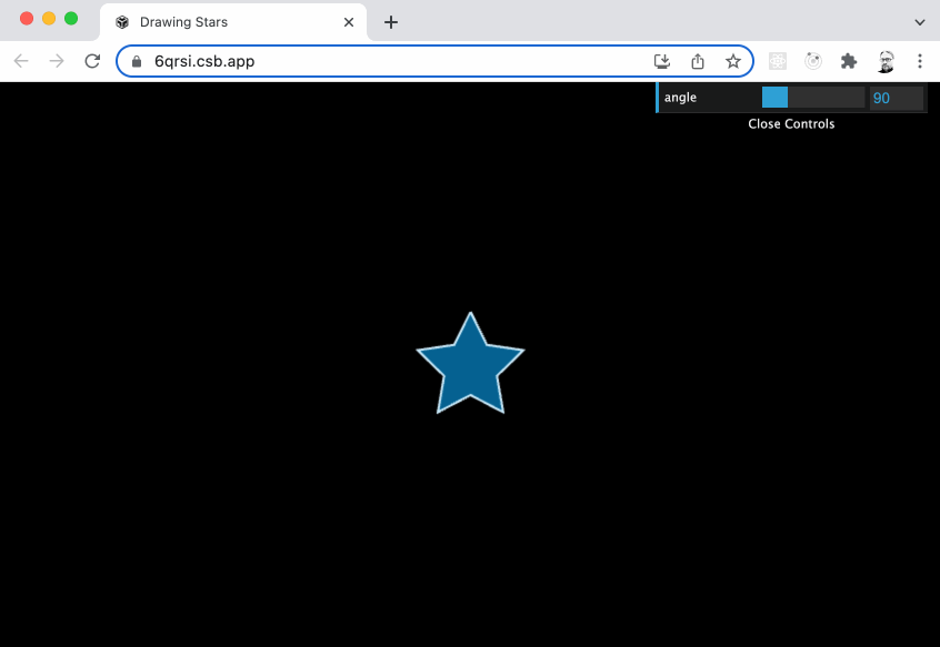
By adding min and max numeric values, the range turns into a slider control easily adjusted with the mouse. For example, we want to bind angle from 0 to 360 degrees.
const state = {
  angle: 0
};

gui.add(state, "angle", 0, 360);
The above code results in:

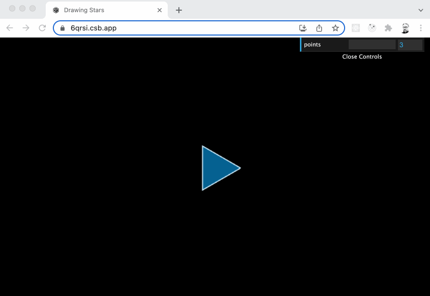
Step Size and Precision
Depending on the data, you mean need to control the precision of stepping.
For example, a property such as points it intended to be a whole value integer. Set the step size to 1 to assure no decimals:
const state = {
  points: 5
};

gui.add(state, "points", 3, 24, 1);
The above code sets the points property between minimum value of 3 and maximum value of 24 while stepping by 1 value:

Step size can be any arbitrary amount. For example, maybe we want to lock our angle or rotation property by 45 degrees.
const state = {
  angle: 90
};

gui.add(state, "angle", 0, 364, 45);
The above code sets the angle property between minimum value of 0 and maximum value of 360 while stepping by increments of 45 :
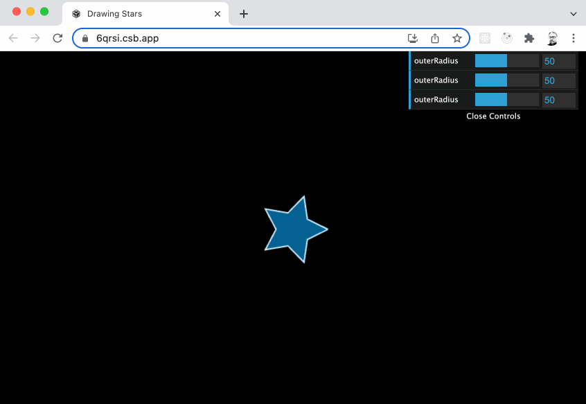
For precision, simply change the step range to a decimal value.
const state = {
  outerRadius: 50
};

gui.add(state, "outerRadius", 1, 100, 0.1);
gui.add(state, "outerRadius", 1, 100, 0.01);
gui.add(state, "outerRadius", 1, 100, 0.001);
The above code shows three example of settings the outerRadius property:
0.1— Stepping by tenths0.01— Stepping by hundredths0.001— Stepping by thousandths
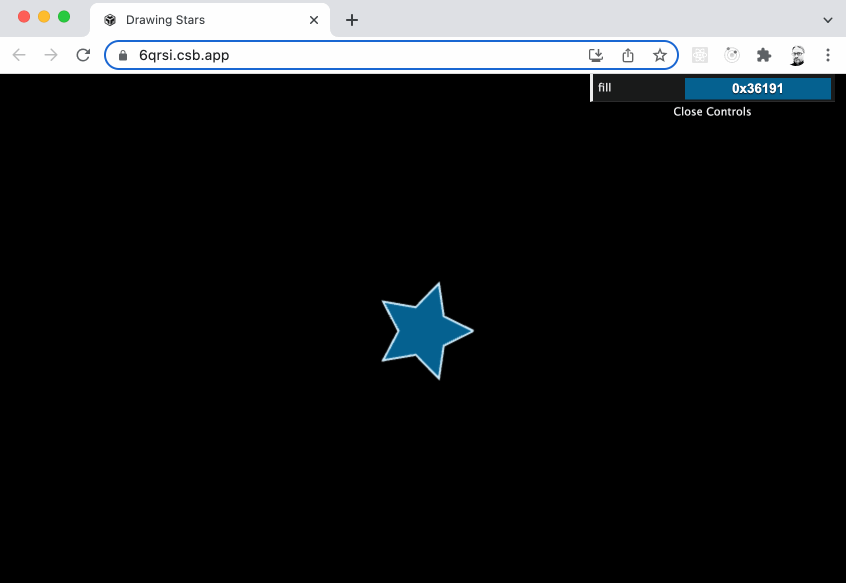
Colors
Able to recognize multiple color formats, manipulate color properties with a color picker tool using the addColor() method:
const state = {
  fill: 0x36191,
};

gui.addColor(state, "fill");
The above code produces a color picker:
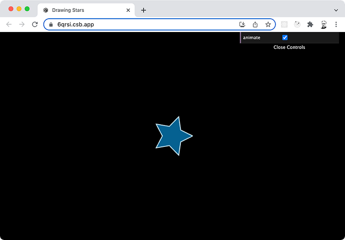
Checkboxes
Boolean properties can be toggled on and off by adding them without arguments:
const state = {
  animate: true
};

gui.add(state, "animate")
The above code results in a checkbox:
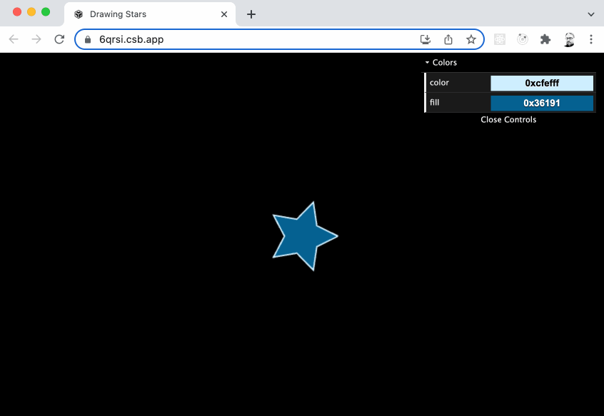
Folders
To group properties, add them to individual folders. Any arbitrary number of folders to can be created by using the addFolder() method:
const guiColors = gui.addFolder("Colors");guiColors.addColor(state, "color");
guiColors.addColor(state, "fill");
guiColors.open();
In the above code, a folder named “Colors” is created, and properties are added to that folder. By default, the folder will be collapsed at startup.
To have the folder expanded at launch, use the open() method on the folder.
Combo Boxes
Choose options from combo boxes using:
gui.add(state, 'options', [ 'Option 1', 'Option 2', 'Option 3' ] );Data Binding
If your backing model is changed, you’ll want to bind changes to update the UI by using the listen() method.
The controller will listen for any changes to the model.
gui.add(state, "points", 3, 24, 1).listen();

setInterval(() => {
  ++state.points;

  if (state.points > 24) {
    state.points = 3;
  }
}, 100);
In the above example, setInterval is changing the points property, which is reflected in the UI by listening to changes in the model:
Change Events
If you need to implement specific functionality on change, use the onChange event listener to handle events:
gui.add(state, "points", 3, 24, 1).onChange((value) => {
  console.log(value);
});
In the above example, whenever dat.GUI changes a property, the onChange passes the new value to the handler function.
Summary
Component development has come a long ways with tools such as Storybook, yet through it all I still find myself going to back to dat.GUI as a elegant and simplistic solution.
Learn more at the dat.GUI GitHub or API documentation pages.
View the CodeSandbox example of Drawing Stars referenced in this story.
